Girl Scout Site Redesign
Context
The 1,000+ council members running the 110 Girl Scout councils nationwide use the site to find time-sensitive resources for their councils.
Girl Scout council members face challenges navigating, while the membership team is overwhelmed by frequent site updates each membership season.
Membership seasons are annual periods when members join or renew, leading to a surge in registrations and increased demands on the site.
Research
Survey
6 Interviewees
3 Tasks to Complete
22 Survey Responses
Respondent Location
Key Insights
Excess Information
Overlap in content with other departments creates cognitive overload for users.
Confusing to Navigate
Navigation on the site is vague, it is often unclear where items are located.
Time-sensitive Documents
Time-sensitive documents are often not up to date, such as seasonal membership forms.
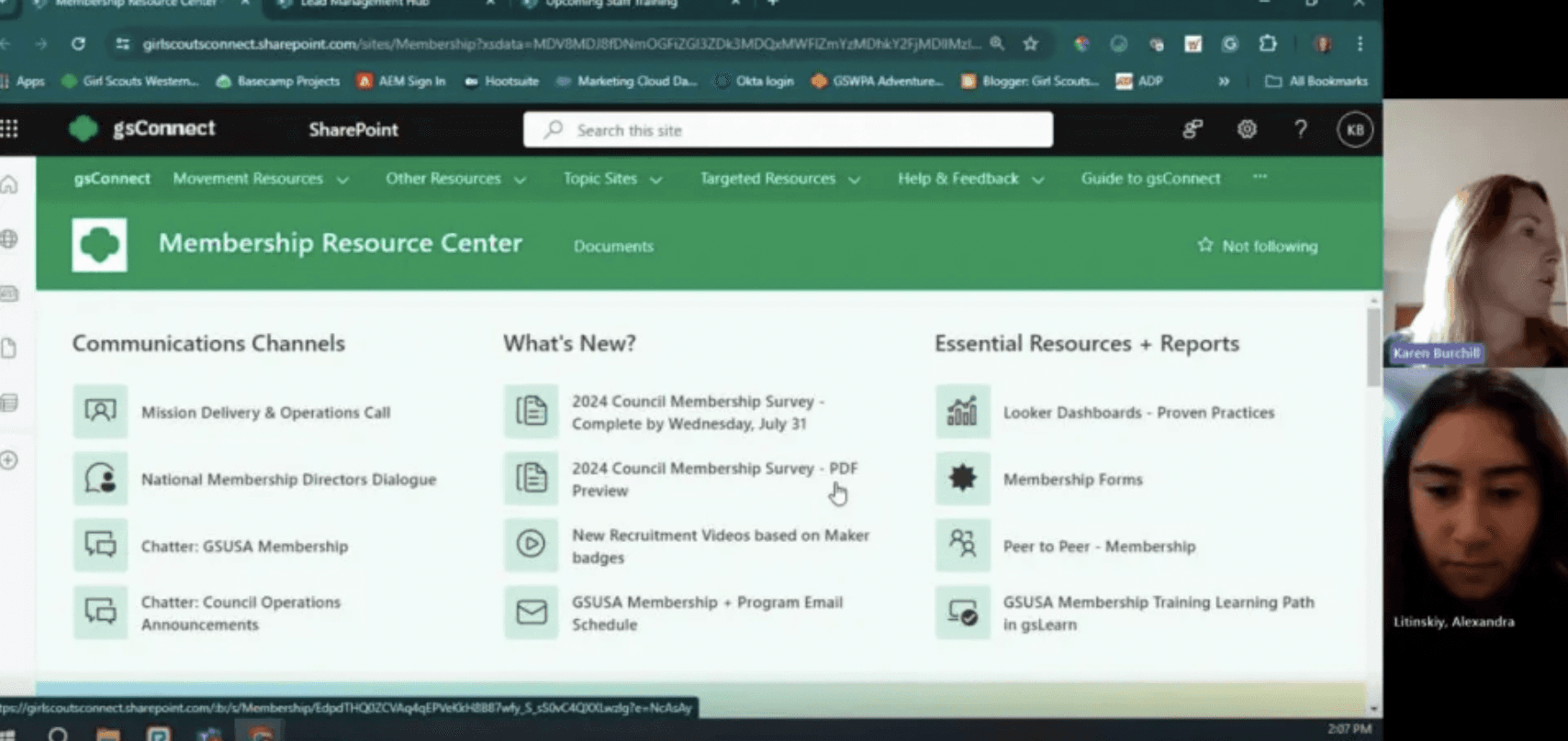
Working with the membership team at Girl Scouts of the USA to redesign their internal facing site: the Membership Resource Center.

Unclear Organization
Focus on Efficiency
Screenshot from user interview.

Homepage Designs
Hub Pages
Icon System
Redesign Results
Future Redesigns & Reflections
Me!
Overall...
A frequent issue reported was users being redirected to unexpected locations after clicking on links and buttons.
To ensure clarity and prevent surprises, I added an icon next to each clickable link or button.
The key lives on the homepage.

Specific key links, such as recruitment marketing assets for recruitment hub.
The last section of the drop-down menu on each page contains all time-sensitive resources related to that hub.
This makes it faster for users to locate resources but also easier for the membership team to update accordingly.
Time-Sensitive Documents
Completion Time
70-80% decrease
User Satisfaction
45% increase
Task Success Rate
25% increase
Future Usability
At the end of my internship, I created a document outlining page layouts to ensure consistency across future pages.
Reflections
This internship helped me gain confidence in my UX research and public speaking, among other skills.
I loved collaborating with a supportive team and delivering a final product that will benefit thousands of people after my time with the company and look more forward to more opportunities like this.
“I spend a lot less time on the MRC [Membership Resource Center] now - I have an understanding of where different resources are located and can find them quickly”
Timeline: 10 weeks
Role: UX Research, User Testing, and Design
Summer 2024
User Interviews & Tests
Tasks were routine actions performed on the Membership Resource Center.
Original Design Task Completion Time Averages
The redesign should allow users to complete a task in under...
The Challenge
Redesign the site in a way that is intuitive for users and easy for the membership team to regularly update.
Internal Site Redesign

Redesign Task Completion Time Averages


The communication and data links under operational hubs.
Membership team contact information is right underneath.
Updates & Quick Links limited to 7 items.
Overview and
related news.
Drop-down menu for each page's content.
Check out my TherMOOstat case study!
Let’s connect!
Task 1
137
Seconds
8.5
Task 2
118
Seconds
9.1
Clicks
Task 2
19
Seconds
3.1
Clicks
Task 3
21
3.4
Task 1
24
Seconds
3.6
Clicks
Seconds
Clicks
Clicks
30
Seconds
Clicks
5
85%
Grouped the recruitment, retention & renewal, and lead management hubs together in the card sort.
Card Sorting
To understand how people naturally group things.
The results came in handy when structuring the site.
Grouped results from 20 testers.
“I click something expecting a document to open, but I am taken to a new page.”
“I don’t care where the info on the site is as long as I can find it quickly”
Users prioritized finding information they need to complete their tasks over its exact location.
User found it frustrating that they never knew where a link or button would take them.
Unintuitive Navigation
“Not easy to find specific things on the site, I have to explain where to click first, second, third”
Key User Interview Quotes
Users relied on memorized paths to locate specific resources. When they forgot a step, they were stuck.
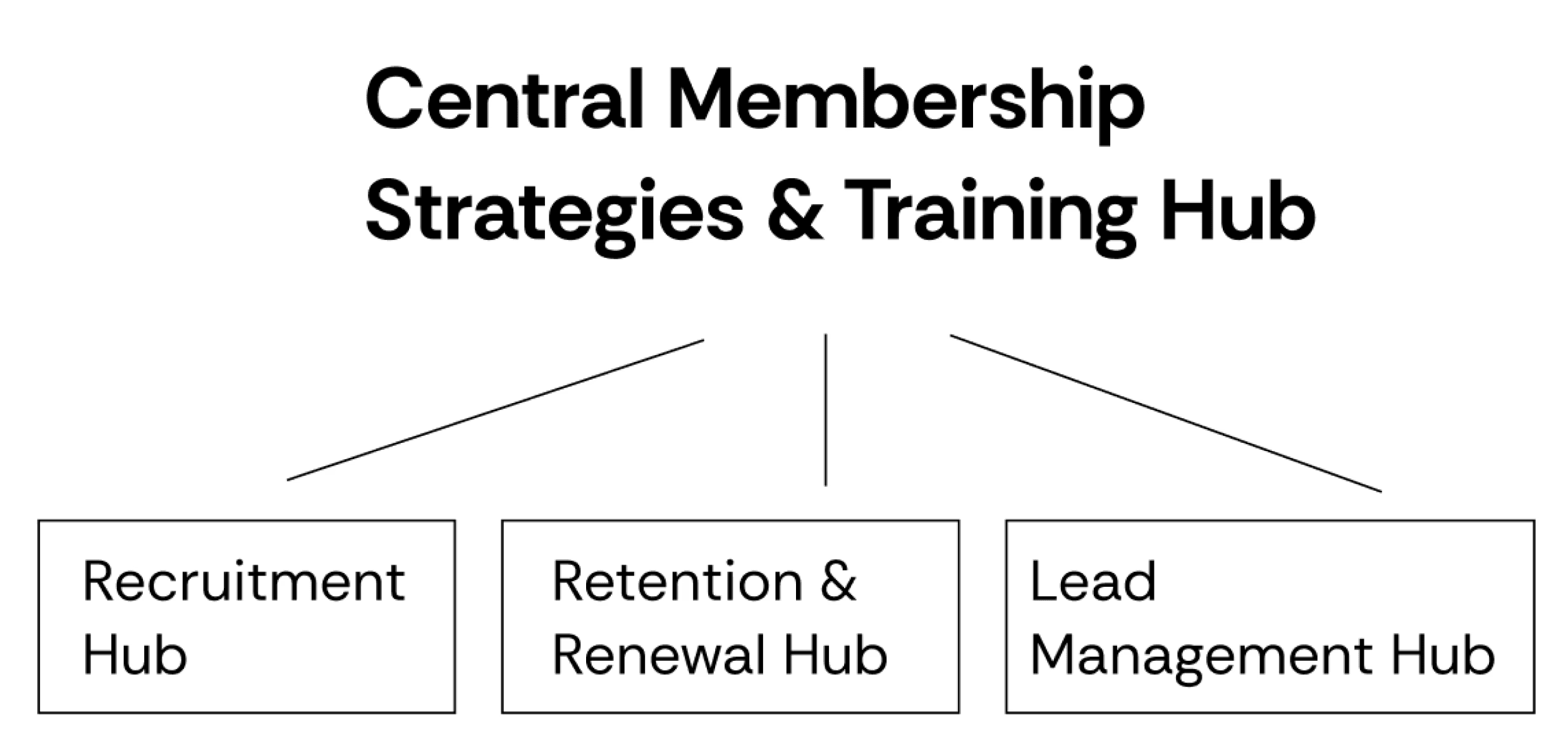
Navigation Structure
Hubs are the main navigation tools to find resources.
Quick registration for webinars hosted by the membership team.
Central navigation hub is Membership Strategies & Training.
Final Redesigns
Task 3
125
Seconds
8.4
Clicks
Girl Scouts Internal Site Redesign
Membership Resource Center Site Redesign
The Problem
GSUSA staff and Council Members struggle to find membership assets in the MRC, while the membership team is overwhelmed by needing to constantly update the site.
I set out to redesign the site in a way that would make the experience smoother both for the user and next person updating the site. I wanted to help my team beyond my internship timeline.
Research
Survey
For context, the majority of the users of the MRC are council members, they run the 110 Girl Scout councils across the nation.
Council members look for resources on the MRC based on the membership campaign at the time, so it is important for them to find the right time-sensitive resources quickly.
I conducted a survey to get a general sense of how councils interact with the site & their pain points.
Survey Questions Asked
It’s easy for me to find what I need on the MRC.
Answer scale: 1 — Strongly disagree | 10 — Strongly Agree
If you answered below a 6, what do you find most frustrating about the site?
Survey Results & Key Takeaways
22 total responses
Although users use the site to find specific resources they need relating to membership, there is often overlap with other departments, such as marketing. There is a large amount of information on the site that is not clearly grouped.
Navigation is confusing, it takes too long and is often unclear where items are located.
Councils are frustrated when time-sensitive documents are not up to date, such as membership forms.
Card Sorting
To get a better understanding of how people naturally group things and what kind of language they use, I conducted an open card sort.
I pulled 44 categories from the different sections of the MRC and placed them in random order side by side. Users titled their own groups and added categories to each.
Card Sorting Results
28 total responses: 15 from council, 13 from GS HQ
The card sort highlighted patterns among users, such as staff training being its own section and there being a high frequency group titled “Membership 101” or “Membership Resources”.
I then took the titles of all the categories made and put those groups together and gave them titles.
User Interviews & Tests
6 people from 6 different councils across the country
Users completed 3 different tasks and then answered a series of questions. I wanted to see people interact with the site live and gauge their emotions as they navigate through the site.
Key Quotes from interviews
“I never know where thing are, my go-to method is to skim and scroll through everything”
“Not easy for new council staff to find specific things on the site, I have to explain where to click first, second, third and after, you get the hang of it, but is not easy at first”
“I don’t want to ping-pong between different sites ie. membership and marketing, don’t care where the info is as long as I can find it quickly”
“I automatically go to the search bar to try and find what I need, because it’s faster and too frustrating to keep going from this page to that page”
Key Takeaways from Interviews
1. There was no information architecture on the site and users were often taken to another site when they clicked on a resource, causing frustration.
2. People did not navigate intuitively, they memorized paths they took to find specific resources, and when they forgot a step, it was difficult to proceed.
3. If it took over a minute to find something, people usually searched at the top or asked for assistance.
4. People mainly cared about finding the information they needed to do what they needed, the location mattered much less.
Quantitative Data
Average Time & Clicks to Complete Tasks
Task 1 Average: 2.28 minutes, 8.5 clicks
Task 2 Average: 2.15 minutes, 4.2 clicks
Task 3 Average: 2.38 minutes, 9.5 clicks
My goal was for it to take under 30 seconds and 5 clicks for each task.
I also recorded all the clicks that the user would make when getting to their task to notice patterns.
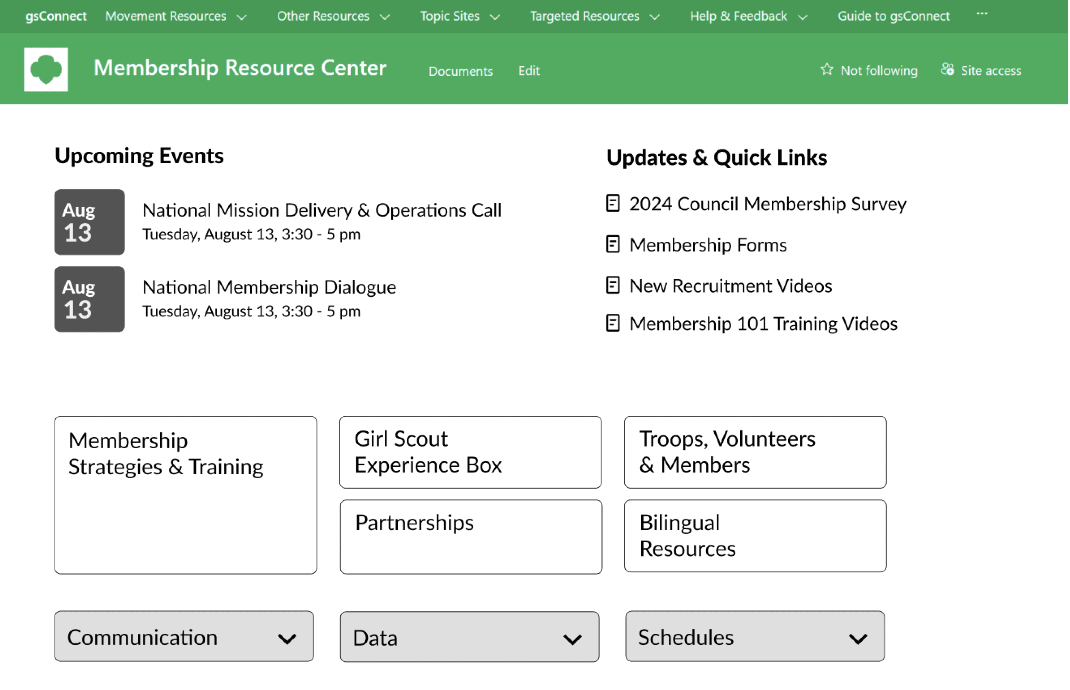
The Redesign
The Homepage features
A welcome section in the top left for consistency across GSConnect, the platform which houses all these sites. Another intern working on UX design asked to feature this across all department sites.
Easy to scan upcoming events; the membership team hosts 2 big webinars every 2 weeks. Users often visit the site to register for these, but have to spend time finding them. I made it much quicker to find.
Limited Updates & Quick Links to maximum 7 items.
Membership Strategies & Training hub being the central navigation hub.

More Homepage Features
The communication and data links are located right under the operational hubs.
The Membership Team contact info is located right below the hubs.