TherMOOstat Redesign
Context
What is TherMOOstat?
TherMOOstat is UC Davis' crowdsourced tool for gathering campus heating and cooling feedback to improve energy efficiency and comfort.
What is our goal?
Expand the site's purpose beyond data submission by making it more interactive and showing users that their feedback makes a real impact.
At the time I began working with the team on this project, the designs were in hi-fi stages.
After selecting a character, the user was taken to a specific version of the map showing campus-wide feedback.
This structure lacked a clear mental modal for users to follow.
Original Design
Lack of Clarity
After submitting feedback, you select one of three characters - this created confusion.
Each character represented a different version of the campus map.
Informal Testing
I had concerns about the usability of the features so I tested with a few target users informally. I asked questions such as “What does this screen mean?” and gathered feedback on the user flow.
Vote Breakdown Graph
Map Filters
Hypothesis Testing
Story User Quote and What It Means
Heating & Cooling Systems Experience
Bonus!
Results
Map Markers
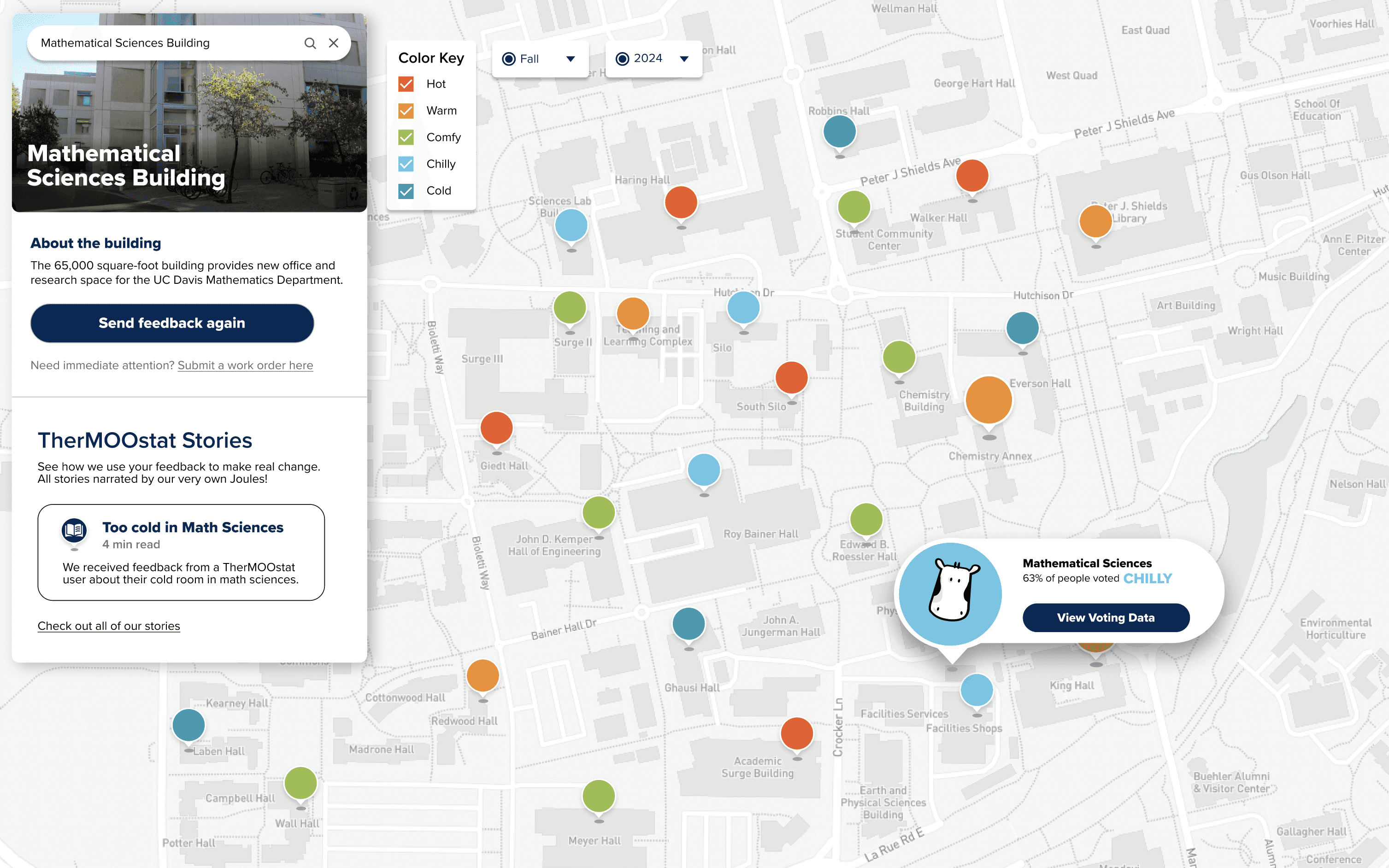
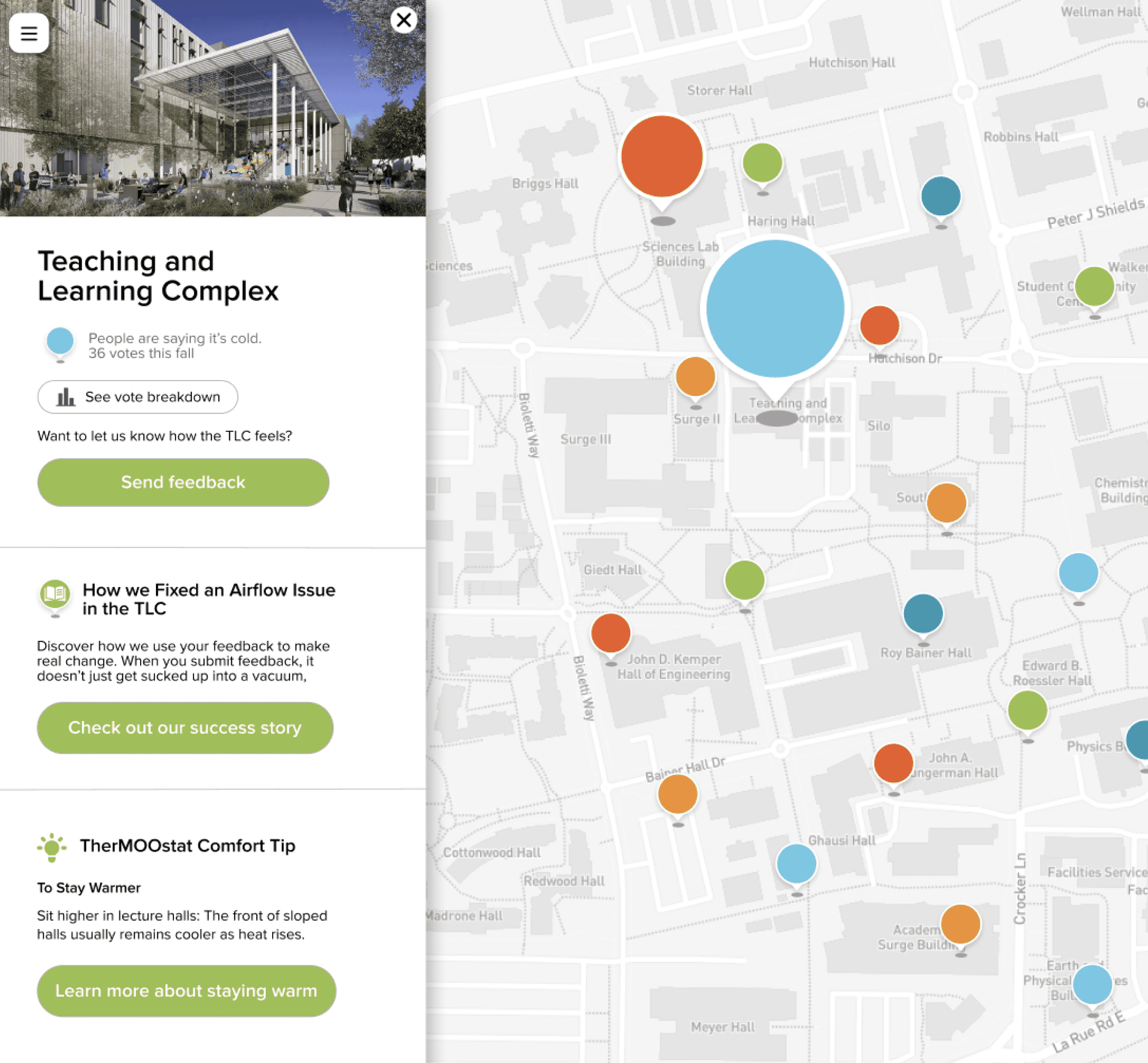
Map markers are the colorful circular icons indicating the majority comfort vote for each building.
User Experience Goal
Mid-fi Redesign Key Features
Unclear that characters were versions of the same map.
Unclear that the first choice didn’t lock out other options.
No clear mental model for the user to follow.
"The story tells me changes happening to improve student comfort through our votes".
Null Hypothesis
The amount of exposure to cooling & heating systems does not affect the level of engagement with the site.
Alternative Hypothesis
The amount of exposure to cooling & heating systems negatively affects the level of engagement with the site.
Stories were successful in making testers think about the impact of their feedback.
Map Marker Size
A larger map marker means more people voted for that building.
Timeline: September 2024 - current
Role: UX Research, User Testing, and Design
Team: Kiernan Salmon & Katherine Ong
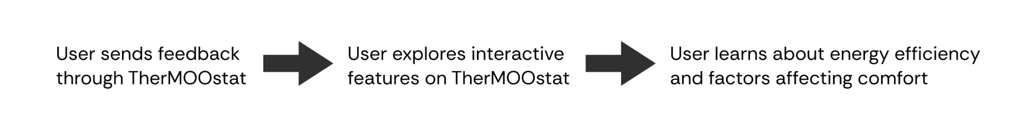
Making the post-data submission process more engaging with new features.
Ongoing Project
Data Collection Site Redesign

Task 1
137 seconds
8.5 clicks
Key Quotes and What They Mean
“Why are there three [characters] of them?”
“What if I want to go back and pick a different one?”
“You’re trying to create a thing other than a database”
Redesign Ideation
Hi-fi Redesign
User Testing
We conducted testing with 20 UC Davis students to validate our designs.
Transparency
A graph breaking down voting data for each building.
Redesigned central map screen users see after submitting data.
Vote Breakdown Graph for Math Science Building.
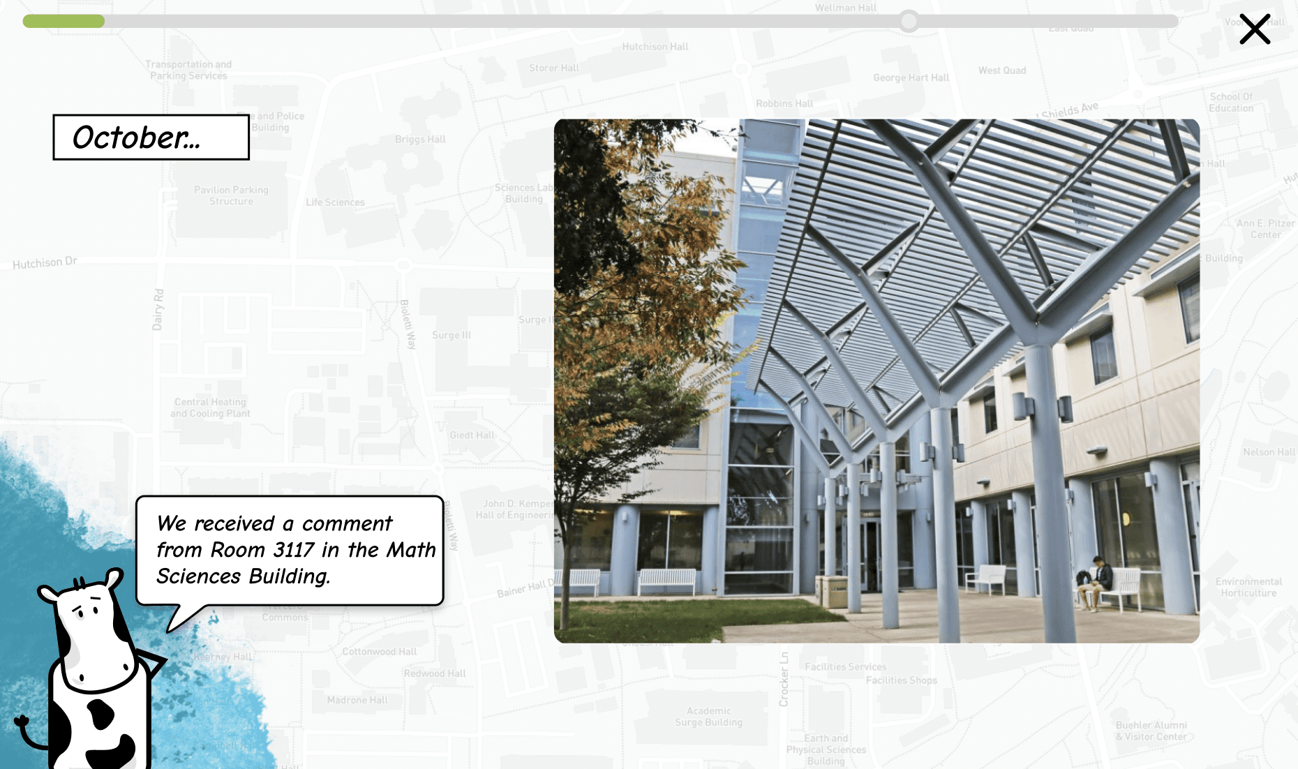
A slide of the interactive story, presenting feedback received, investigation, and subsequent outcome.
Story slide
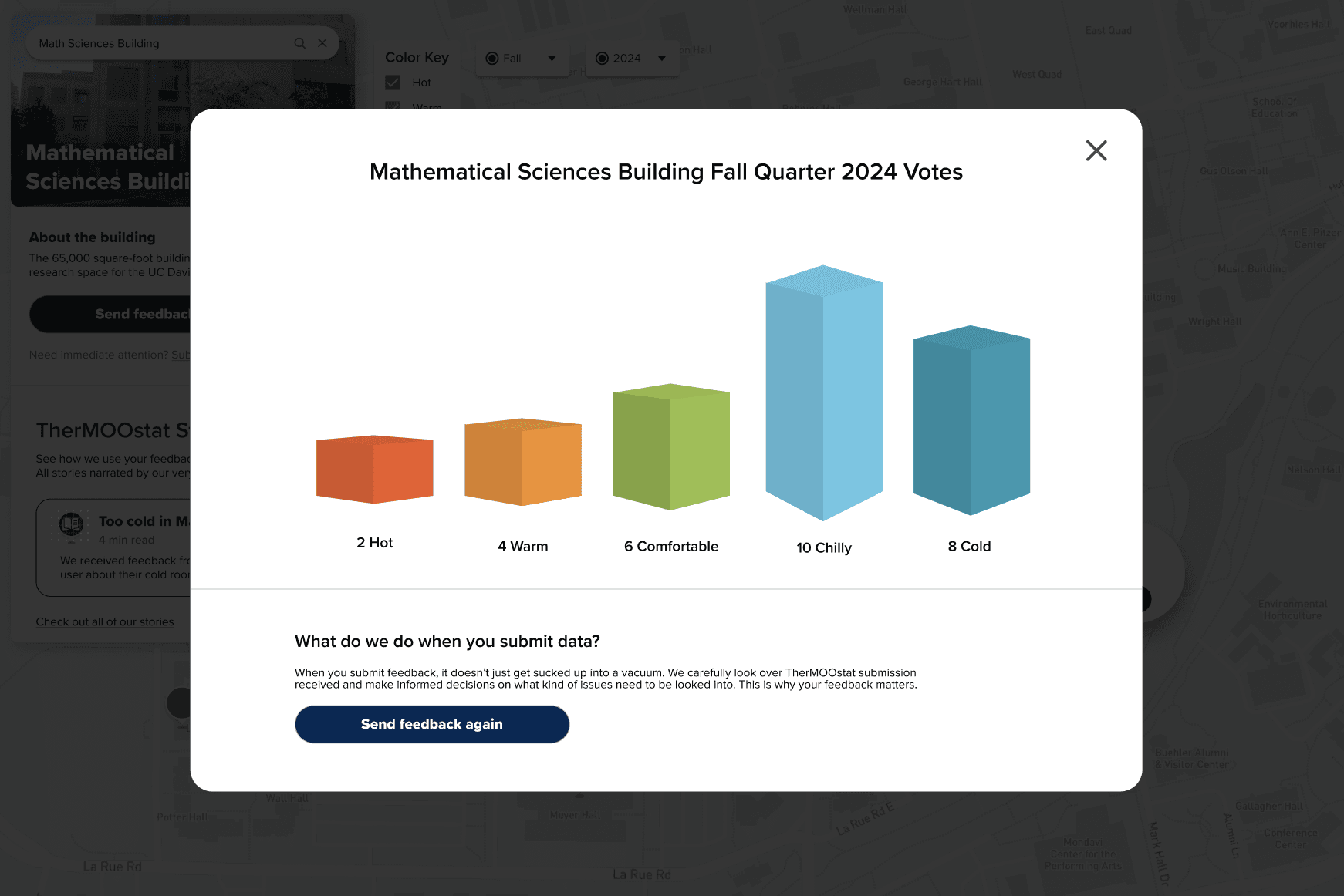
Graph breaking down the votes for each building.
20 Total testers
4 Tasks to Complete

90%
65%
70%
Noticed map markers first when looking at map screen.
50%
Noted confusion regarding the differing sizes of the map markers.
40%
Assumed marker size represents vote strength rather than total vote count.
60%
Vote breakdown graph aided the overall understanding of data.
We can say with statistical significance that more industry exposure to cooling & heating systems/TherMOOstat correlates with lower engagement with the site.
TherMOOstat Stories
Test and finalize the development strategy for creating TherMOOstat Stories.
Map Designs
Iterate on the current designs to minimize user confusion with map markers.
Heating and Cooling Experience Relationship
Investigate what drives the negative relationship between experience and site engagement and understand how to optimize for all users.
Next Steps
Successfully filtered to summer data on the first try.
Attributed ease of navigation to top left location of the filters.
85%
Rated their story learning 4 out of 5 or higher.
Rating of 4 or 5 = the story taught me something about heating/cooling
15.6 seconds for experience
24.6 seconds for little or no experience
TherMOOstat Stories
An interactive feature showing how past feedback led to more comfort and energy efficiency.
I noticed those with more experience in heating and cooling systems were less engaged in the content and wanted to investigate this.

4 Elements Tested
Map Markers
Vote Breakdown
Map Filters
Stories
Engagement level measured by number of seconds user spent exploring the screen after completing all tasks.
I presented my testing findings to my team and was asked to come up with a redesign that dealt with the issues found.


Featuring investigation story on selected building.
Feedback is for Buildings
Users can “follow buildings” by selecting them.
Only One Comfort Tip
Rather than a whole map layer with many tips.
Interactive Stories
Feedback stories are now an optional link on sidebar.
A Redesigned Central Map
A single, central map simplifies the user experience without detracting from it. The most important info is the campus-wide map data.
Side panel gives more information on buildings.
The 3 map layers you can toggle between.

Stories of Past Feedback
An interactive feature showing how past feedback led to more comfort and energy efficiency.
“This helps me see the degree of the temperature and where data leans”.
Filter by Year
Filter by Quarter
Key showing color meanings


Check out my Girl Scouts case study!
Let’s connect!